The short answer
A lead-focused website helps the right visitor understand your service, judge whether you are a suitable provider and take a clear next step. Review the message, evidence, mobile journey and enquiry process together.
People visit your website, but very few make contact. The pages look polished, so you wonder whether the problem is the design, the content or the traffic.
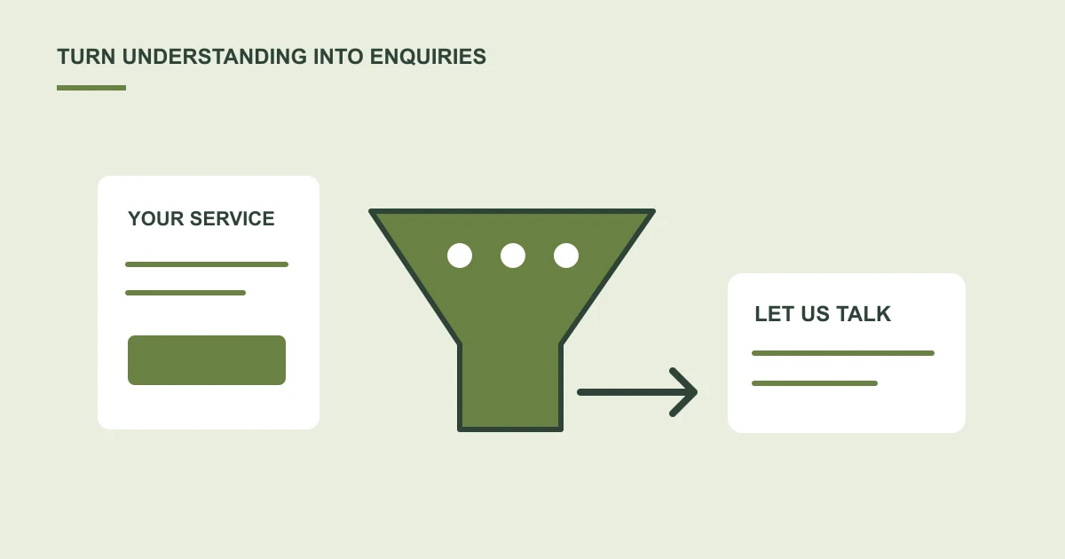
Before changing colours or adding another animation, follow the journey from a visitor's question to a useful enquiry.
Make the offer easy to understand
The first screen should help someone understand what you do, who you help and where to go next. A broad slogan may sound impressive without explaining the service.
Give each important service enough space to explain the problem it addresses, the work included and what a client needs to prepare. Avoid asking visitors to decode your internal terminology.
Give people reasons to trust you
Use relevant portfolio work, clear case studies and genuine testimonials you have permission to publish. Explain your role accurately and avoid unsupported performance claims.
Show who is behind the business and how someone can contact you. A clear process can help visitors understand what happens after they enquire.
Choose a clear next step
“Discuss your project†and “Request an appointment†describe different actions. Choose wording that matches what your team can deliver, then make that action easy to find.
Keep forms proportionate to the first conversation. Ask only for information you need to respond usefully, and explain what happens after submission.
Review quality as well as quantity
Check enquiries received, the services people ask about and whether they are a suitable fit. A bigger form count is not automatically a better business result.
What should I ask someone to test on our website?
Give a person unfamiliar with the site a realistic task: find the right service, decide whether it fits and explain how they would contact you. Observe where they hesitate or need information that is missing.
Review the same task on a phone. Check whether the contact route remains visible, the form asks sensible questions and its confirmation explains the next step. This is more useful than asking only whether the page looks attractive.
What happens after the visitor submits the form?
An enquiry needs a reliable destination and a person responsible for responding. If messages are lost or wait unassigned, a better page design alone will not repair the handover.
Our lead capture guide explains storage, notifications, connection failures and follow-up ownership. Include these requirements in the design brief if enquiries are a main goal.
Which project evidence is relevant?
The Yukt Law case study documents a website redesign, hosting and SSL work, with mobile lab-test screenshots. It is useful evidence of that delivery scope.
It does not report an increase in leads or sales. When reviewing a provider's portfolio, distinguish evidence of what was delivered from evidence of a measured business result.
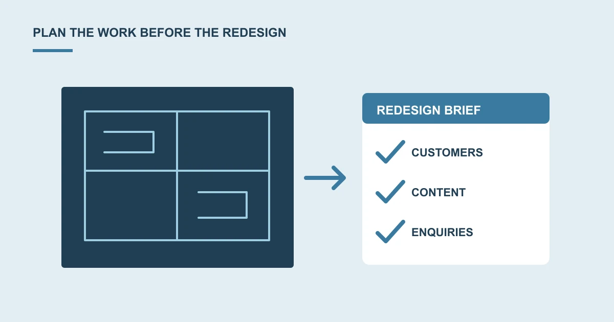
Discuss a website redesign around the customer journey you want to improve.
Common questions
Can a redesign guarantee more leads?
No. Traffic quality, demand, pricing, the offer and your response process also matter. Agree which visitor journeys to improve and measure meaningful enquiries rather than promising a fixed increase.
Is a contact-button click the same as a lead?
No. A click does not confirm that a form was submitted or that the team received a useful enquiry. Agree what counts as a completed enquiry.
Should we add a longer form to qualify everyone?
Ask for information needed for the first response. Additional questions may be appropriate, but check the customer journey and avoid collecting unnecessary details.
Sources and project context
- Yukt Law Offices: redesign and continuing website care Web Build Solutions project record
Turn the question into a clear next step.
Tell us about your current setup, the people using it and what needs to improve.